Posts in Party House
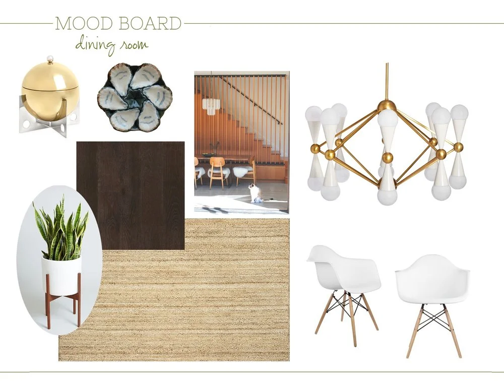
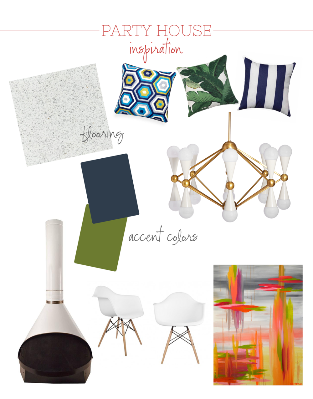
Party House Dining Room Inspiration

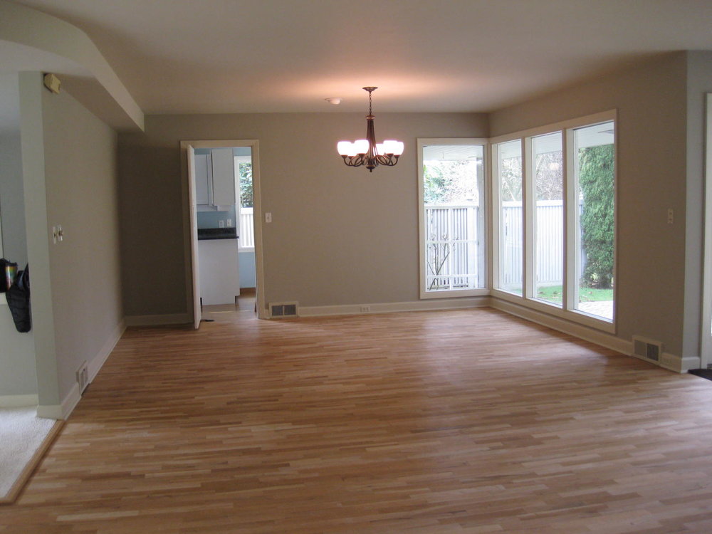
The dining room is actually just fine.  It's really only a space between the kitchen and the living room and it's not that remarkable.  But it will end up with changes because the rooms that it is smashed between are getting some massive alterations.

The biggest issue I think I might have with the dining room is making our vintage furniture that is a family heirloom fit into a new version of our decor.

I've seen loads of houses where they remodel and it looks amazing but then they stick in their old furniture that doesn't go with the space and it kills the whole thing.  I don't want to kill the whole thing.  Luckily I've seen several houses "get it right" combining modern style chairs with the old table.  We'll definitely try that - and Craigslist is a treasure trove of modern style chairs that no one wants anymore.  
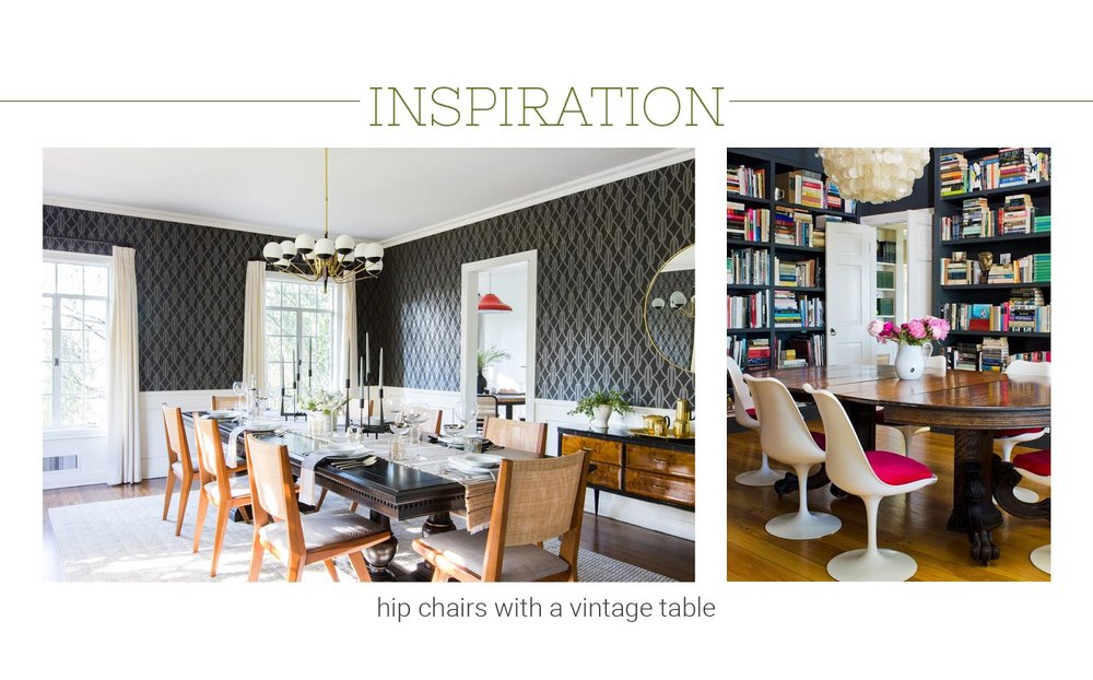
This room is also ending up to be the room with the 'statement' chandelier. Unless I change my mind and decide to add one to the living room...  There's still time.  So it needs to be good.  Modern, but not too "modern;" classy but not traditional, providing light but not glaringly bright.  So far, I'm digging on the Jonathan Adler versions of chandeliers that seem to hit all of those points.  But maybe something vintage?  

Since there aren't that many issues, there doesn't need to be massive change.  However, since it's situated between two rooms that do need an update.  Here are the issues I do see us addressing:

1. The wall between the stairs and the dining room is a major block and I can't see the front door from the kitchen which is annoying because I like to be in the kitchen and still talk to people. 

2. I want to be able to go inside and outside from this room.  Nana walls are the dream - maybe?  They do have a hefty price tag however.  
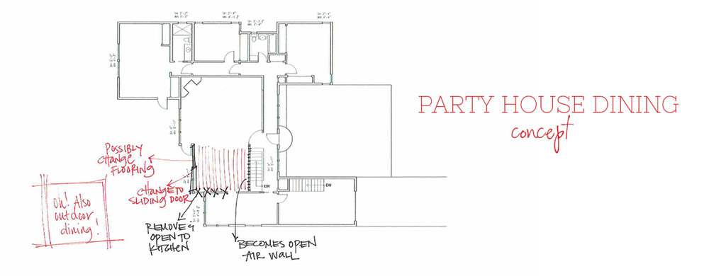
Soon I'll share what I'm thinking for the living room + we'll get into some real, actual floor plans from the architect!  Can't wait to get this moving just a little bit faster.

xoxo, ali


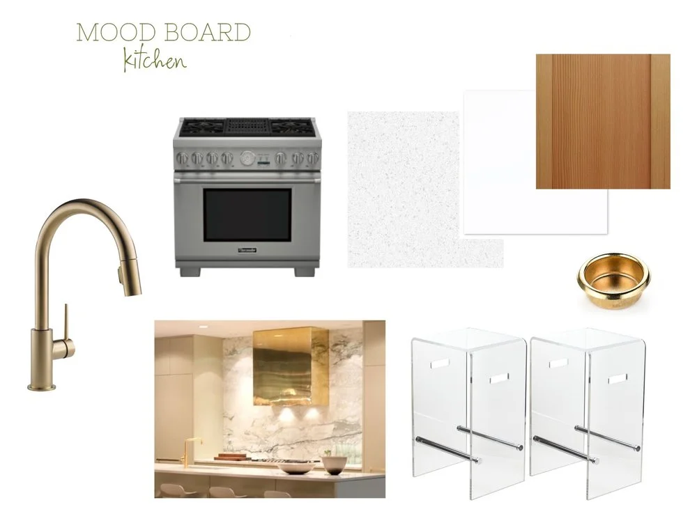
Party House Kitchen Inspiration

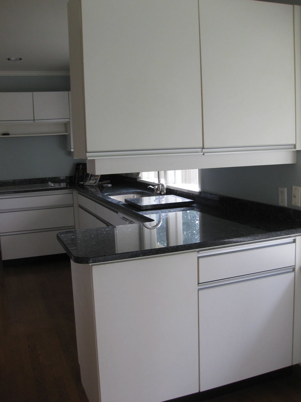
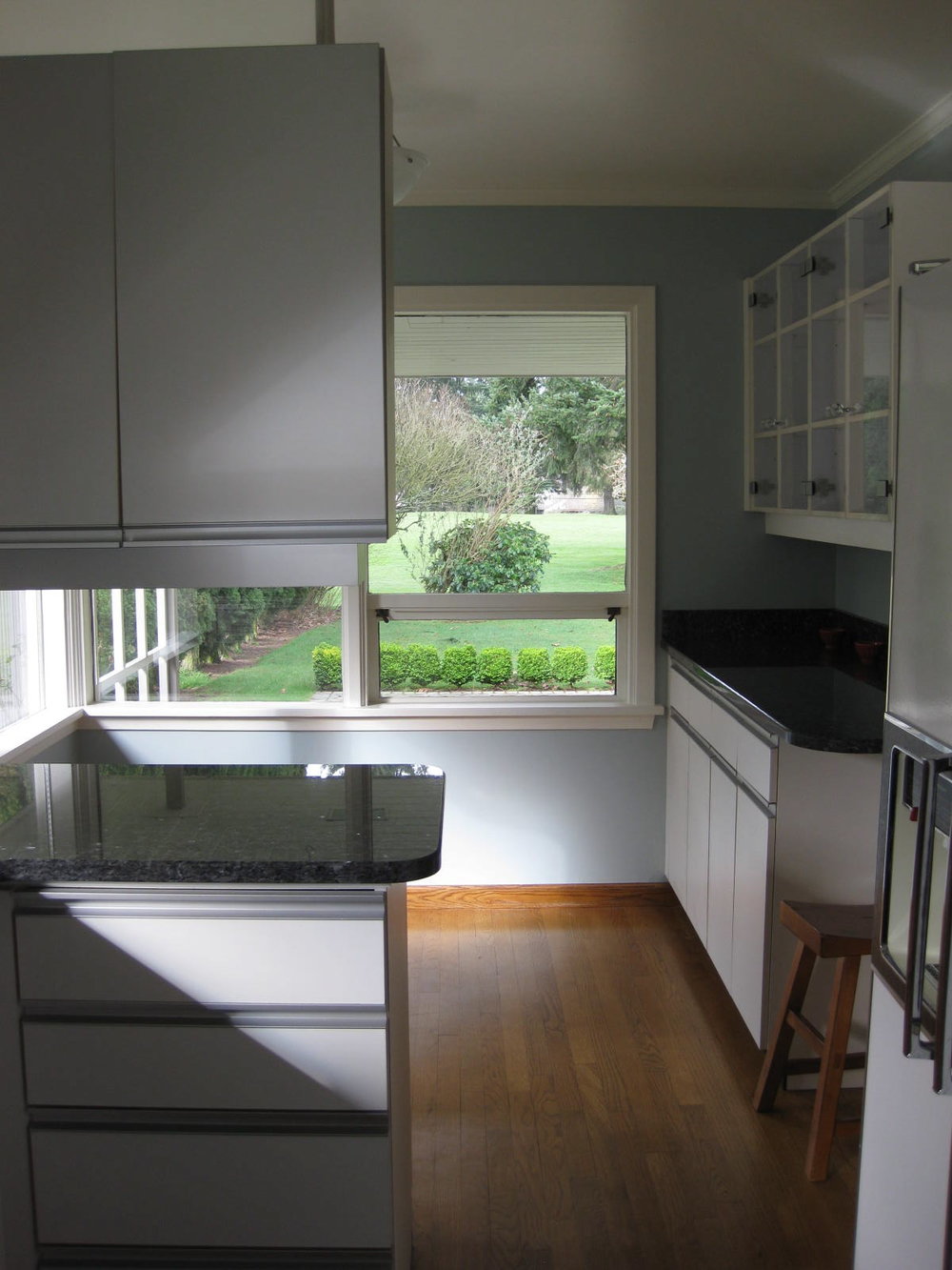
The kitchen is the most important part of my house.  Always.  Our current kitchen is the worst of the worst.  I think there are apartments in New York City that are bigger than this kitchen.  Given that I have a growing collection of vintage bar-ware, kitchen ware, plates, etc. this really needed to change.

Despite how tiny the actual kitchen is, there is all this extra room on the other side of the counter that is not being used very well.  We've stuck a table and bench in the corner, but it could be so much better with a counter stretching into it and the other side open into the dining room.

As you can see, there are a lot of things that need to change.  The priorities are:

1. Open up the kitchen onto the rest of the house.

2. Increase storage but also keep it looking really clean and simple.

3. Make it functional for all of us to work in the kitchen at the same time.

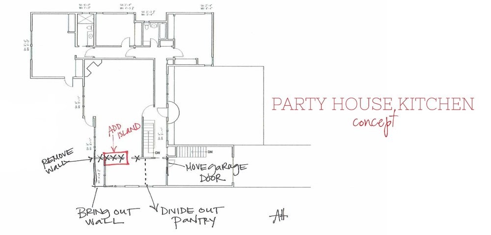
Here's the plan:

1. Remove the wall between the kitchen and dining room and push the kitchen a few feet so it's the same length as the dining room (there's currently a three foot gap).

2. Create a pantry space for storage so there doesn't need to be overhead cabinets in the kitchen + a spot for a second oven, second sink & dishwasher.  

3. Create an island between the kitchen and dining room so there is ample work space all the way around the counters.

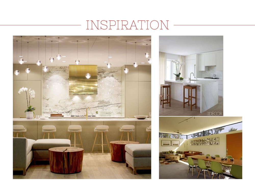
I'm dreaming of opening up the kitchen and having an island between the kitchen and the dining room.  And that brass hood?  Are you kidding me?  I'm having a brass hood for sure.  In talking to Mr. Hedin, it's actually way more affordable than it looks.  We can purchase basic hood mechanics and hang them up.  Then we can have a metal worker bend a frame and hang that from the ceiling around the basic mechanics.  (This is why you marry a contractor ladies.)

I want the space to feel really open and light while maintaining some element of mid-century.  The ribbon windows will help to bring light in without staring at the neighbors house.  Having the room open to the rest of the house should help with the rest.

This is a room that I plan on spending loads of time.  So I'll be putting loads of thought into this space!  I can't wait to show you the next steps.

xoxo, ali
 

Shop the look


Party House Inspiration

The first thing Mr. Hedin and I thought of when we started dreaming of our new house was the Parker Palm Springs.  We love the Parker.  We love going into Mr. Parker for a Manhattan.  We love wandering the grounds.  We love the vintage vibe of the whole place.

I have pinned one million images from the Parker, Emily Henderson, and my latest idol, Sarah Sherman Samuel.

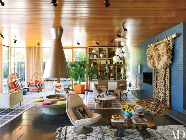
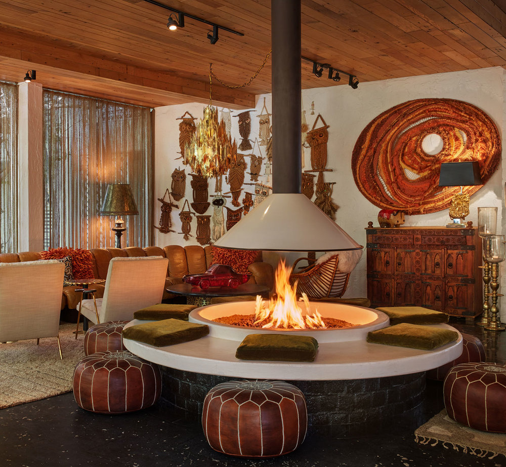
Jonathan Adler and Simon Doonan home images

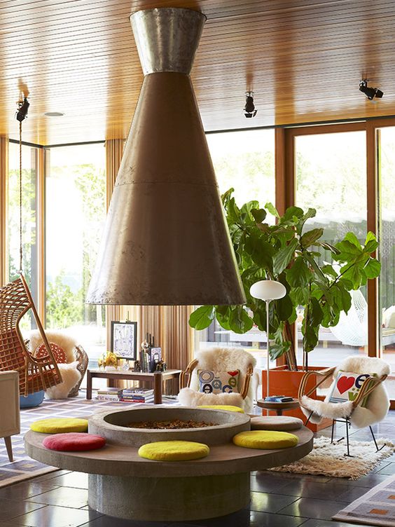
We've stolen ideas from all of these fabulous designers to make our dream house.  The most important - the showstopper - the centerpiece - will be a freestanding fireplace of some sort.  I'm hoping against hope that it looks like the fireplace in Jonathan Adler and Simon Doonan's house.  Our energy codes in Washington State are a little fussier than they are in New York which means it can't be totally open like this.  

Despite our architect visibly sighing when I said this is what I wanted, he's come up with some ideas that will work within the rules.  It's going to be awesome.  

Parker Palm Springs image via Parker website

image via Sarah Sherman Samuel

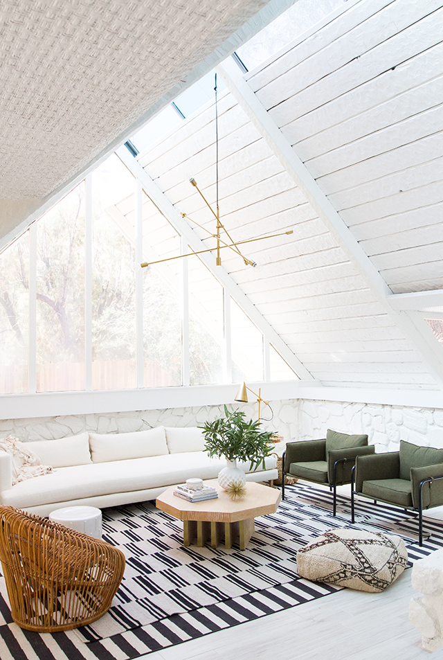
We will have about 800 windows on the backside of the house and everything inside will be painted white.  I can only hope it reflects the light the way this A-Frame reflects the light!  The pictures of us will be so pretty. Let's be honest, you don't design a house that you can't take a good photo of yourself in.  White walls for the win.

image via Emily Henderson

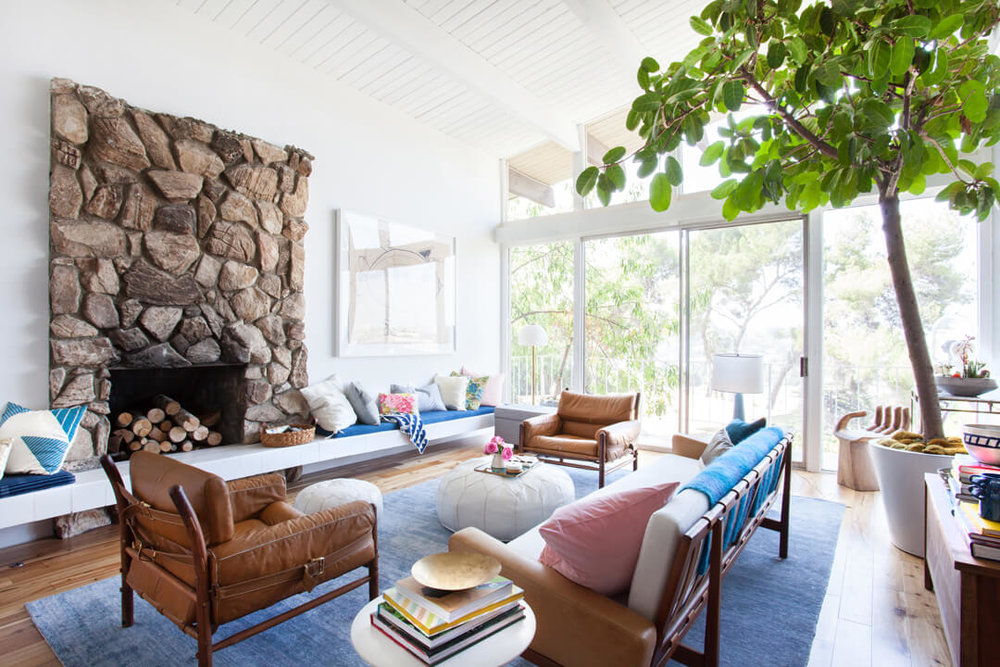
I'm really drawn to these spaces that echo the 1970's aesthetic.  I'll be bringing in loads of color but only in accents and wall hangings.  The walls, floors and basics will be neutral colors so I can change my mind a lot because you know I will.


xoxo, ali
 

Party House Before

The Hedin family has decided to embark on a major massive remodel project.  By major and massive, I mean we have to move our of the house and we don't get to go back into it for almost a year.  All of my fingers and toes and ankles are crossed in hopes that it will be done in less than a year.  But we all know how big projects go...

The original house was built in the late 1940's early 1950's and has some elements of mid-century modern (which we love) but not enough elements to be actually cool.

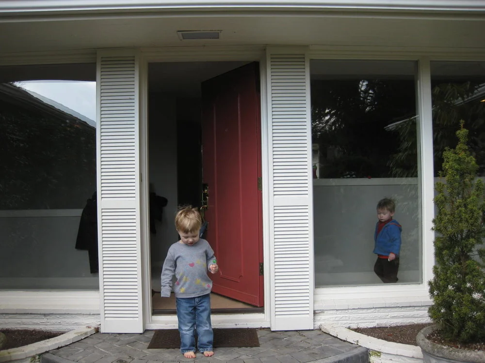
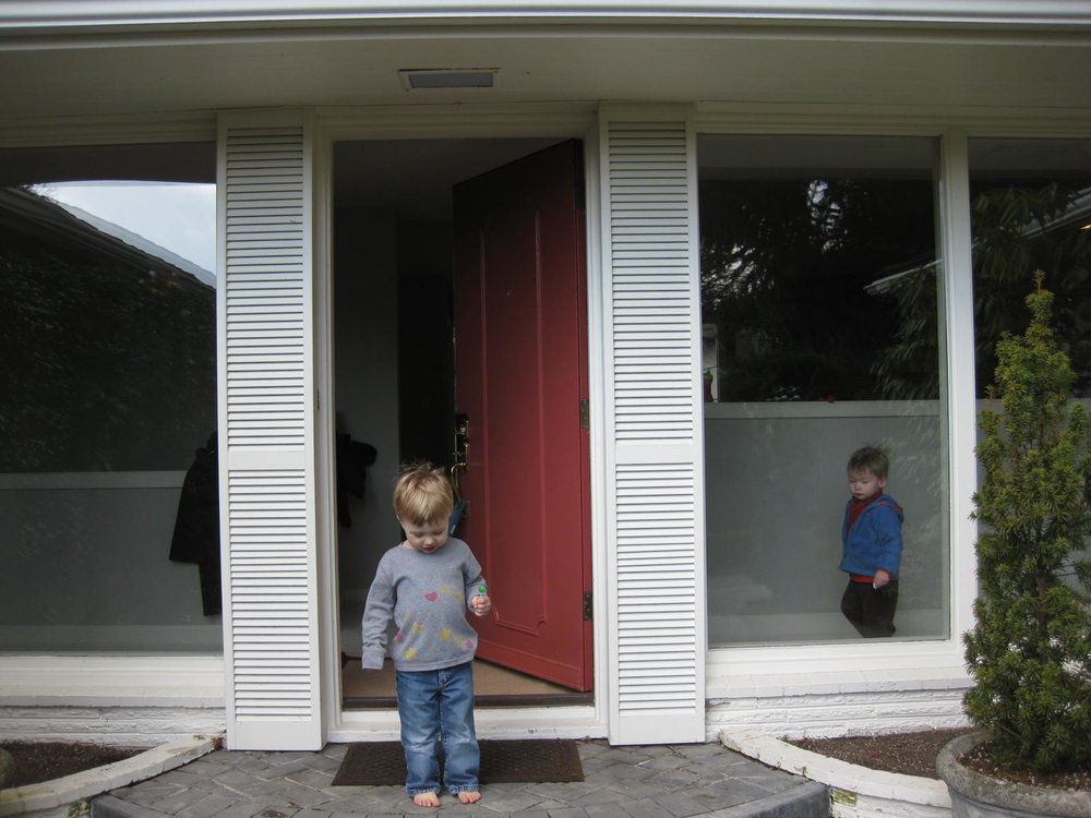
Ugg, the front door.  Let's start with the front door I guess.  It's ugly.  I believe they painted it red to sell it because the color has faded dramatically since we bought the house.  The windows are awesome.  The shutters on the side?  The curvy everything at the front?  No thank you.  This all has to change.

The front entrance has a front door that pops you into a small entry area.  When the front door is open you are held within a small four foot area that's a little tight for greeting people and taking coats.  When friends come to get their kids from playdates there's a weird thing where you have to get the door open, then closed to get the children from down the other hall.  It's awkward at best and it makes the front entry seem really tiny even though it isn't.  

That curve though.

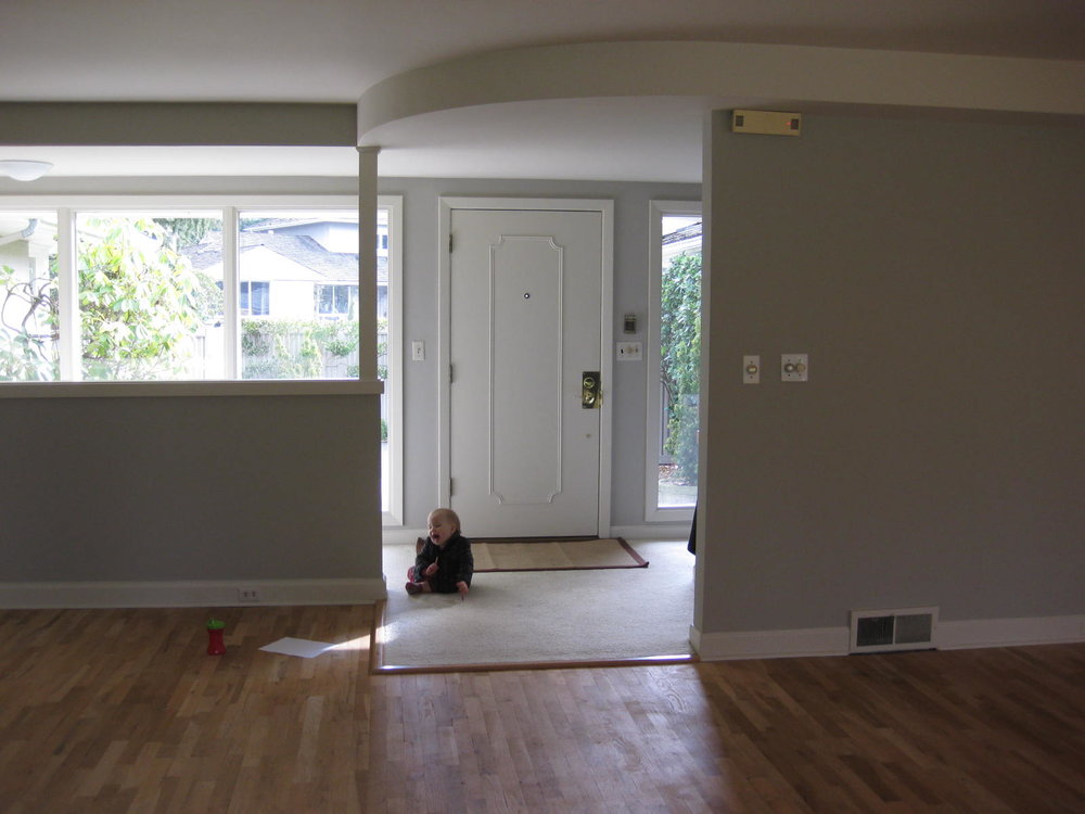
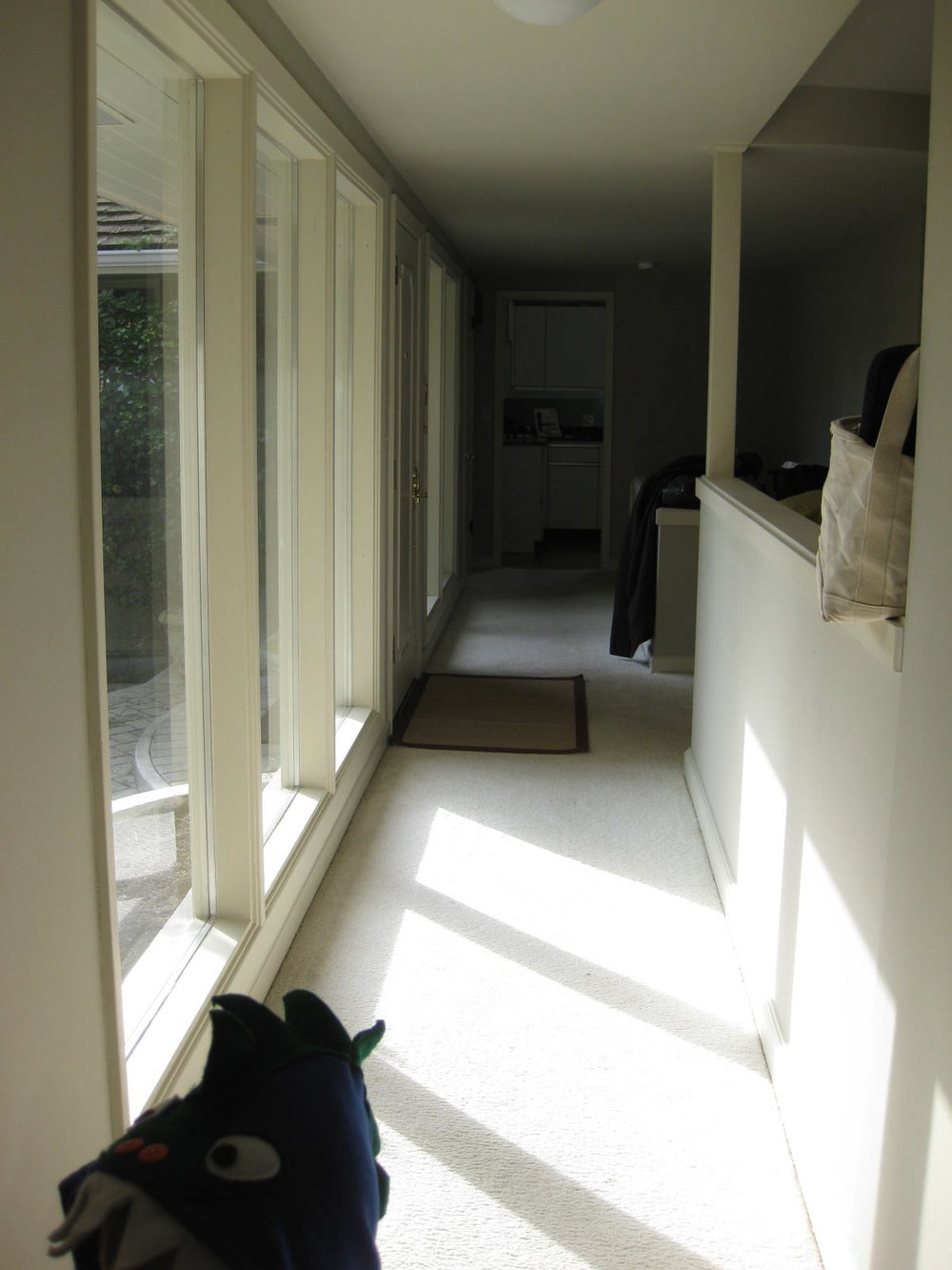
There's the front door on the left and this is the hallway from the kitchen to the bedroom "wing."  I have adored that white wall on the right because the light it bounces is fantastic. Otherwise, it divides the living room from the front hall and it's kind of awkward.  Note the bag on the top?  It's become a perfect storage for coats and it makes me crazy.

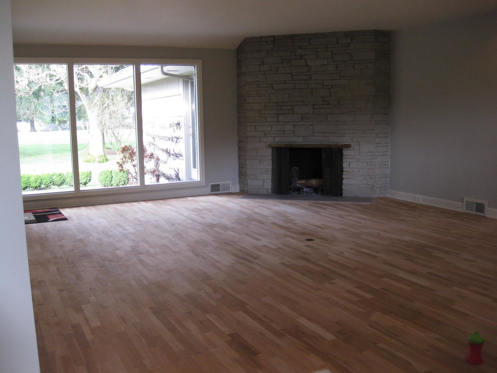
The living room is huge.  Huge huge.  It's been so fabulous to have such a huge space.  That fireplace was one of the things I loved when we first walked through the house because it is so decidedly vintage.  Turns out, however, if you want to arrange furniture around a corner fireplace you've got to get really creative or ignore the fireplace entirely.  I've chosen option 2.

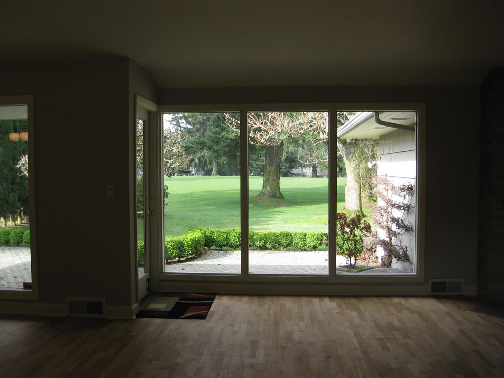
There's also the quirky trick of getting into the backyard.  Do you see it through those windows?  That huge backyard is accessible through a small door that's right where that carpet is on the left.  Wouldn't it be amazing to slide open all of those windows and access the yard? Especially on the gorgeous days of summer we have in Seattle.

The dining room shares the same issue as the living room; no access to the backyard.  But more importantly, look at how that kitchen is hidden behind the swinging 'saloon' door and you literally can't see anyone from one room to the other!  For someone who lives in the kitchen, this is really annoying.  

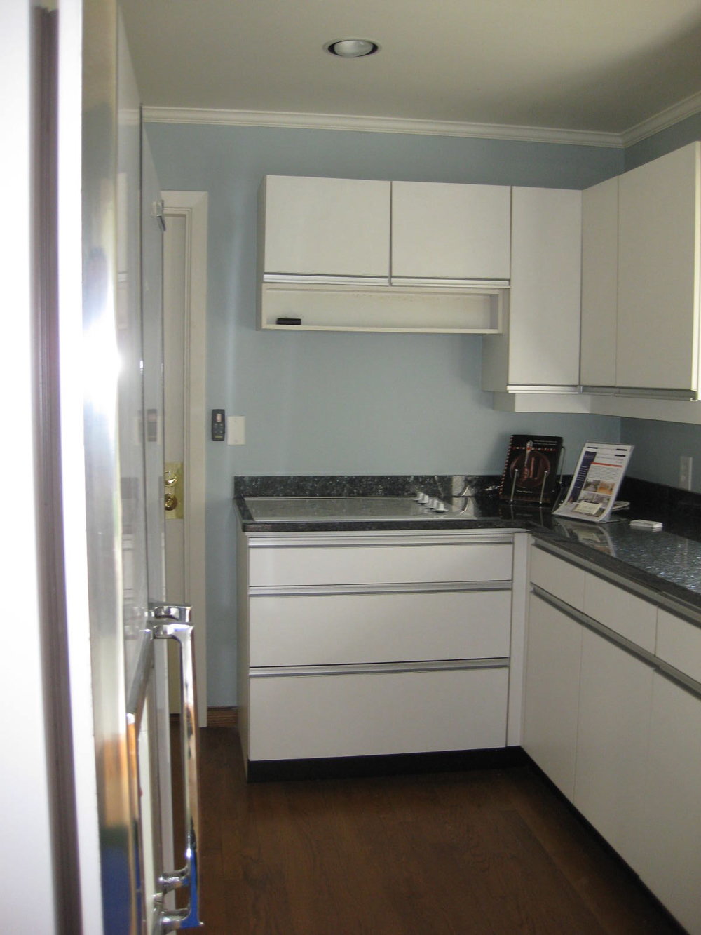
Speaking of annoying.  Here's the kitchen.  I don't know if I need to say more.  If you follow my blog regularly, or know my app Weeknight Society, or have been to my house ever - you know that I love to cook.  This kitchen is a real pain in the ass for someone who loves to cook.  

This room needs loads of work - a configuration that's more useful for entertaining, a stove that's powered by gas, removing upper cabinets so you can see more clearly, and a whole lot of cosmetic changes.

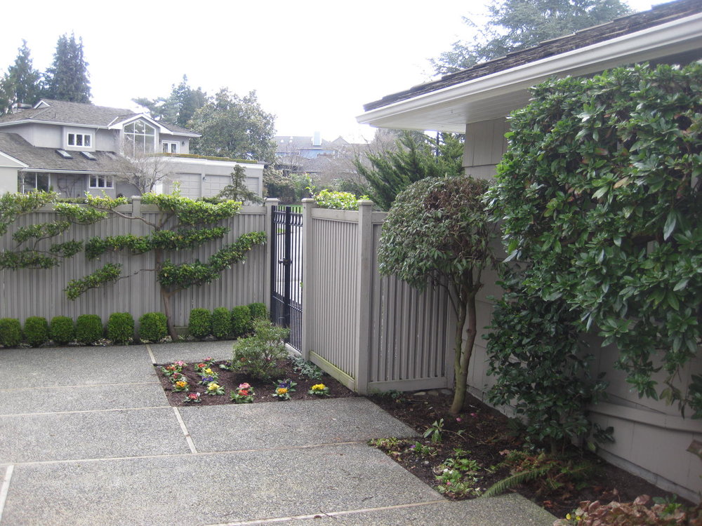
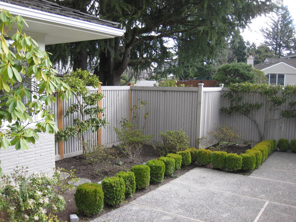
Our backyard is pretty open since it backs up to a golf course.  So the front yard has been made more private with this fence.  It's great for keeping the dog in when you need to, but we moved into this house because we love the neighborhood, we love the neighbors, we love that our friends walk this neighborhood regularly.  The fence has made it hard for them to know when we are home - and we feel so isolated from the neighbors playing football in the street.  I love those trees on the fence, but otherwise, it's got to go.

Mr. Hedin and I are so excited to get started on this project.  I'll post once a week on the inspiration, the direction we're heading, the design (!) when it's ready to share, and every step along the way as we bust out these walls and make this house a real party house.

xoxo, ali