Posts in Party House
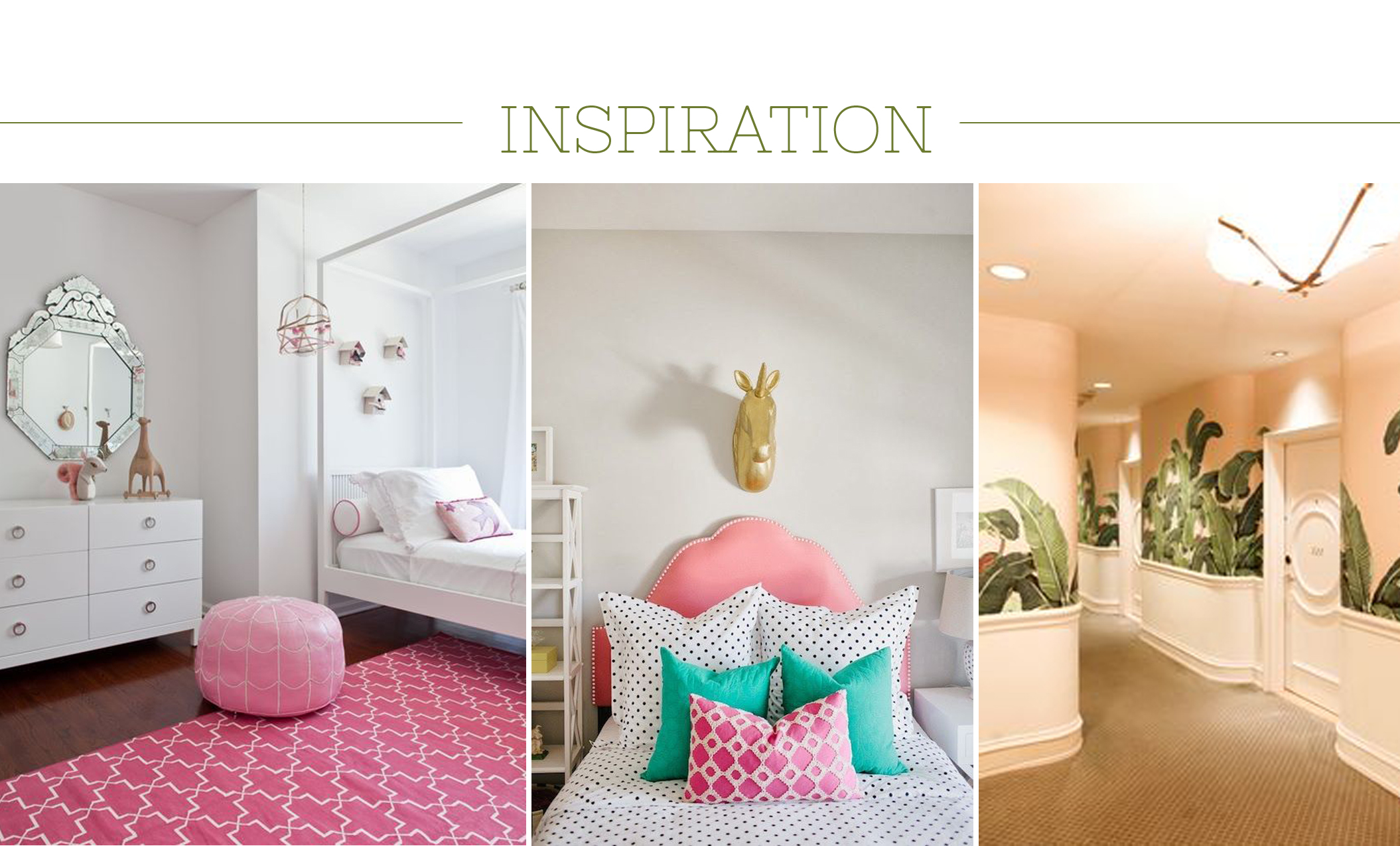
Weeknight Party House {a girl's unicorn room that can grow up}
Inspiration 1/2/Beverly Hills Hotel

Inspiration 1/2/Beverly Hills Hotel

Do you know what’s a real trick? Letting your eight year old girl “help” design her room while making sure it’s something she’ll like in the long run - and - more importantly - fits with my aesthetics as a super anal retentive person.

Here’s where the disagreements are:

  1. She has a really unattractive hanging “pod” that’s hot pink. If it was a rattan hanging chair I’d be all over it but she wanted a cozy & snuggly one. There’s a chance you’ll never see it in photos.

  2. Pink. I have no problem with pink but not on all of the walls. It’s a little too much.

  3. Unicorn everything. Again, there may be things that no one sees in photos that she gets away with. Think sheets.

My goal is to create a room that she will grow into. I feel like some of the things she wants now she won’t want in a few years and I don’t want to re-do large things like repaint. We’re working on some compromises that will make both of us happy.

I think.

Ali Hedin | Little Girl's Room

Here’s how I think we’re solving the issues.

  1. We’re painting the ceiling pink. A very pale pink from Sherwin Williams called Charming Pink. It’s not the walls, you won’t see it from the hallway, but it will create a warm glow in the room. She’s happy, I’m happy.

  2. I’ll add a pink lamp and she already has a pink poodle rug, so that will tie in all of the pink. It’s also easy things that can be removed later or updated to seem more “grown up.”

  3. Inexpensive art on Etsy. She can choose what she wants and we can swap it out without guilt when she’s bored of it.

What do you think? Will it work? Will I end up giving in?

floor plan by David Coleman

floor plan by David Coleman

Weeknight Party House {Window Update}
Back of the house facing the golf course

Back of the house facing the golf course

I get questions almost every day about the house. I am happy to talk about the house because I also can’t wait to see progress but the usual update is “not much.”

The reason it’s “not much” is because we are playing a waiting game on our windows. While we wait things are happening at the house - really exciting things like drainage. But not enough that you’d walk by and say “wow, look at that!”

Our windows were by-in-large the biggest investment of the house. A significant amount of the house is covered in windows and glass doors so we knew that they had to be good. Like really food, amazing good, outstanding good. And we wanted them to last for ever.

Front of the house facing the street

Front of the house facing the street

Our architect specified windows and doors based on pieces they’ve used before and what they like for the “reveal” around the edges. I cannot even remember how many window estimates we went after. Almost a dozen.

The price tag on installing walls and walls of windows is no small number either. So when we were looking at all of the estimates, there was a lot of sticker shock. And sticker shock makes you take a minute to consider which one you are choosing. We took more than a minute. We took weeks.

Weeks.

I’m sure if we would have pulled the trigger immediately we would have windows going in right now but we don’t.

See how great Mandy Moore’s windows look? That’s what I wanted. Link here.

See how great Mandy Moore’s windows look? That’s what I wanted. Link here.

I’m sure you’re wondering what we chose. And maybe why? Here’s what was important to us

  1. Going with one company for windows and doors so everything matches. You would not believe how different “glass colors” can be if they are made by different companies. Most people would probably not notice, but I’m picky like that.

  2. Going with one company also meant one delivery date, one delivery coordination, and one installation team.

  3. I wanted really clean lines inside. And white walls. Which meant the window frames should really be white or very very light to make the lines clean. But the architect specified black on the outside. There is only one company that will create a window & door system like we need that’s black on the outside and white on the inside.

Mandy Moore also has the same sliding doors we will be installing. Giant. Link still here.

Mandy Moore also has the same sliding doors we will be installing. Giant. Link still here.

In the event you are going through the process of choosing windows - or really something large - here’s the process we went through:

  • We requested bids from six different window companies who could all provide the window sizes we have in the plans.

  • We immediately eliminated one company who was a pain in the ass to deal with and I felt like the sales person was really condescending to me. Not ok. Not dealing with that.

  • We also immediately eliminated a company that was really expensive

  • We also immediately eliminated a company that had wood interior and metal clad exterior. While I know that’s a selling point for ‘traditional’ homes, it wasn’t the look we wanted in our house.

  • We discovered that two of the companies offered the same product from the same distributor at different prices. One is the guy in point #2.

  • Once we were narrowed down to two companies we made a list of pros & cons to determine what was important to us. Each company had offerings, so we needed to figure out what we were willing to compromise on. I’m not good at compromise.

The windows will be delivered in January. We are on hold until they come in since the house isn’t weather tight until they get installed. Seattle in the winter isn’t exactly a dry scenario and we don’t want our insulation or anything else to get wet. Once the windows get installed, the progress will seem super fast (fingers crossed).

All drawings by David Coleman

All drawings by David Coleman

The company we ended up choosing is called Minimal Glass. They are a newer company with an excellent reputation - plus a sales guy who could literally sell anything. Minimal can create the doors and windows at the same shop with the same glass and the same sill. We know that everything will match. Minimal was also the only company who could provide a different color inside than outside. So I get white on the inside to match the walls (literally it’s Pure White by Sherwin Williams) and black on the outside to match the rest of the metal work on the exterior.

the house update you didn't ask for
Ali Hedin | Weeknight Party House

From the beginning Mr. Hedin and I have said that this house will take one year to build. When you casually say “one year” it doesn’t sound like a long time. But then… ONE. YEAR.

The Chip & Joanna Gaineses of the world don’t make it any easier. They manage to have the whole house completed in one episode. We all know it takes longer but there’s something so satisfying about watching one hour of a house going from nothing to completed. It also sets a weird expectation that things will HAPPEN. They don’t discuss 12 week lead times for windows or that the tub wasn’t delivered when they went to the plumbing supply house the first time so they needed to go back the next week.

But here we are. This week marks six months of being out of our house. Five months of actual construction (permits took more than a hot minute). There are days when it feels like absolutely nothing has gotten done and there are days when excitement takes over and I can see progress.

I’ll walk you through where we are now and what’s to come. It’s actually getting really exciting.

Plumbing has started going in. I had already chosen all of the finishes I wanted before we even started so that part has been easy. We ordered everything from Ferguson and it has been so simple. Not only because they have a great showroom but because we were able to pick up all of the rough-in pieces as soon as we needed them. Not an ad, just a fan.

Ali Hedin | Weeknight Party House

One of the plumbing choices we went for is wall mounted toilets. The plumber talked us into these when he first came out because we have one room that’s a little small and hanging the toilet on the wall gains us an extra six inches in the room. It doesn’t sound like a lot, but in that space, it will help. The other bonus of a wall hanging toilet is that there is nothing on the floor - I can now mop all the way under the toilet. No weird seam where the toilet meets the floor that gathers funk. No yucky floor smudge that you can’t get up. If anyone else has boys then you understand the need to be able to COMPLETELY clean under a toilet.

Fingers crossed these things don’t break. If they do, we’re taking apart a wall…

Ali Hedin | Weeknight Party House

This outdoor space has been the most work recently. First, we had to wait for the steel to get fabricated and delivered. Once it was in place, our painters came over and coated it with a primer so it won’t rust. Mr. Hedin then had to notch out each beam so it fit over the part you see sticking up on the beam. It was a tedious project and the tool he actually needed to do the job got stolen from the job site the day before he was going to use it. Ugg. Life in the city.

Ali Hedin | Weeknight Party House

Here’s what the end goal will be…

Ali Hedin | Weeknight Party House

Which is a huge improvement over what it used to be…

Sorry it’s fuzzy, it’s all I’ve got of the original.

Sorry it’s fuzzy, it’s all I’ve got of the original.

Ali Hedin | Weeknight Party House

This living room plan has changed a bit since we first concepted it. While the basic bones of the plan have remained the same, a few things have changed. Here’s the original plan and here’s what it will more likely become.

Ali Hedin | Weeknight Party House
In order to see where the new chandelier will hang in the living room, I used spray chalk to mark out where all of the furniture will live.

In order to see where the new chandelier will hang in the living room, I used spray chalk to mark out where all of the furniture will live.

There’s also a chance that my dream fireplace may have to change a bit. I’m not thrilled about it, but I think we’ve come up with a plan that I’ll be ok with. Stay tuned for what that may change to. The good news is that we have time to change our mind.

Due to the fire codes and UL codes and what ever else, we can’t have a gas fire without glass all the way round it. Since I don’t love that idea, we’ve been targeting a bio-fuel solution for the fireplace anyway. It’s clean burning and it’s super simple for a fireplace. What that all means is that nothing is plumbed into the floor that would be a hassle to move. We can pop this thing into place when we want to. Simple.

Ali Hedin | Weeknight Party House

Thanks for following along. I can’t wait to get things really rolling in the next few months. Just in time for the rain in Seattle! Here’s hoping our tarps hold.

party house powder bath inspiration

The grossest thing about our original house was that our children's bathroom was also the guest bathroom.  While I know that works for many people, it did not work for me.  The bathroom constantly had toothpaste in the sink, toilet paper shreds on the floor, and pee on the toilet seat.  Before people would go in there I would rush ahead of them and at least wipe everything down with a clorox wipe. I was grossed out.

So with the new house I knew I wanted a guest bath that was exclusively that.  A room for guests to use that my children (particularly the boys) would not use.  Since it's a unique space I have also played around with the idea of a bold wallpaper or something else fun on the walls.  Mr. Hedin hates the idea of wallpaper pretty much anywhere.  I think there's some post traumatic stress from removing early '90's wall paper in a past house.  

floor plans by David Coleman

floor plans by David Coleman

The architect has called out tiled walls which will look so cool and Mr. Hedin will agree to tile way faster than wallpaper.  Go figure.  I found a beige-y brown color that I love - it has a hint of green in it too - to use for the tile on the walls.  It's such a pretty color with the brass accents that I ADORE. 

There's a chance I'll still put a little wall paper on the wall that isn't covered in tile...  but don't tell Mr. Hedin. 

Ali Hedin | Weeknight Party House Powder Bath

The old "guest bath" had loads of problems.  

1. It was also the children's bathroom which could be gross at times.  

2. The old space was pink + green yet had been renovated at some point with a cheap vanity.  The old toilet was still there and was an off color yellow.  When we put a new toilet seat on it, the whole thing looked even worse.

BEFORE

This bathroom is becoming the new powder bath

This bathroom is becoming the new powder bath

This is the original "guest bath"

This is the original "guest bath"


The new guest bath will be where the master bath used to be and we're turning the original bath that the kids use into a jack-and-jill with no access from the hall.  This will eliminate (hopefully) my need to run ahead of people and clean before they go to the bathroom.  The new space will create a spot for guests and will be so much nicer than the original bathrooms.  


party house demo update
All plans by David Coleman Architect

All plans by David Coleman Architect

Holy floor plan! I know - it's a lot of lines so I'll break it down.  We have gotten so close to permit and the official 'start' of our project and the floor plans have gotten really serious.  The trick with being married to the contractor is that little parts of the project have been able to start - like salvaging the lights in the dining room or the knobs in the front bed room.  Around the house it's looking very exciting!  

Want to review the project with me?  

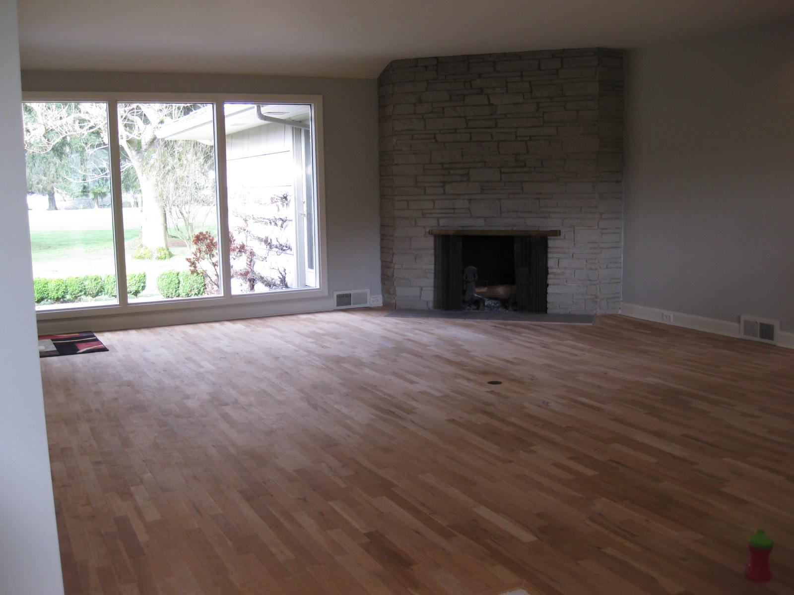
First, when you walk in, you walk into the living room.  There's a short 'entry' space that will have the new upstairs stairway in it as well.  Currently the living room has gotten a few updates since these original photos but since literally nothing is staying, we can start with these photos.  

Ali Hedin | Weeknight Party House Living Room

We've worked with our architect David Coleman to create a mid-century feel to the new space that's isn't "old fashioned."  Functionally, the current space is challenging for two main reasons:

1. You cannot get to the backyard easily.  There's one tiny door that's tucked around a corner and it creates a bottle neck when people want to go in and out at the same time - which does happen.

2. You cannot arrange furniture around a fireplace that's on a corner.  Literally C A N N O T.  I have chosen to ignore the fireplace and not arrange anything around it.  It makes it a little awkward.  Plus since we can't even use the fireplace because it's so old and has inside issues it's totally pointless.  

Ali Hedin | Weeknight Party House
 
Ali Hedin | Weeknight Party House
 

We are removing the fireplace completely.  I hate it and can't wait for it to be gone.  It was actually one of the things I loved about the house when we first bought it because it gave the house such a sense of the era.  But after living with it for seven years I'm done.  

Once that is gone - and it's huge - there will be space for a built in bar and a walk way to the back room which will become an office/library space.  Next to that walkway we're creating a cool slat wall that replicates some of the awesome slat walls of the 1960's and 70's.  

The windows that are so huge and yet such a tease because you can't go out them are leaving.  We found these G I A N T sliding doors that are like four feet wide panels and are so fabulous to replace them.

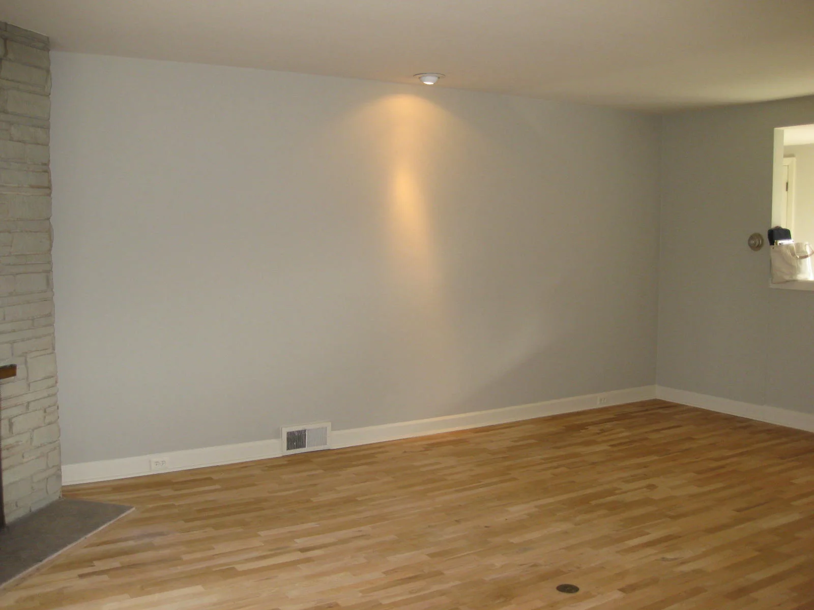
This blank wall becomes the 'slat wall' and possibly holds the television?

This blank wall becomes the 'slat wall' and possibly holds the television?

The best part of this new living room?  A FREE STANDING FIREPLACE!  You guys!  Like at the Parker Palm Springs or on White Christmas.  I am so beyond excited.  Beyond.  The plan is to have a hood made from brass (Mr. Hedin has a guy) and build our own base.  In Washington State you can't have a gas flame without it being surrounded by glass (party poopers) so we are using BioFuel which is not only legal but doesn't need anything extra piped in.  Win.

Model by David Coleman

Model by David Coleman

 
Dining Room Hedin.jpg

The dining room doesn't feel like it's getting very updated.  But it's going to be great because we can actually host people in here without it feeling like a cavern.  Right now it feels like a cavern.  It will help that the giant windows are becoming more giant sliding doors to match the living room. The current solid wall will become another slat wall to match what's happening in the living room.  Not only will it look really cool, but having the wall be open and not closed off which will let in more light and make the space feel more open.  

Ali Hedin | Weeknight Party House
 
Ali Hedin | Weeknight Party House

The floors in the dining room are going to be hardwood.  The living room and the kitchen will be a terrazzo style tile but this space will have it's own unique hardwood floor.  The way these rooms all run together visually, it was the architect's idea to create delineation in the flooring.  From the mock ups I've seen, it's going to look awesome.  

Furniture wise we are attempting to repurpose our existing dining room set, but with updated chairs to keep the space feeling modern without loosing the cool family heirloom that has lived in our house.  

Ali Hedin | Weeknight Party House
 
Ali Hedin | Weeknight Party House

Arguably the most dramatic of all is the kitchen.  The existing space is being divided into kitchen and pantry to create two separate spaces for working, storing, and cleaning.  As I am sure you can tell from the photos, this kitchen is the pits.  Literally it's awful.  Not only is it dark and full of awkward cabinets, but there is virtually no workable counter space.  

Ali Hedin | Weeknight Party House

The new space looks really simple.  And if you are worried about how I am going to cook in the space, have no fear.  I was worried too so Mr. Hedin and I cleared out our existing dining room and literally taped out the floor plan.  Here's why it works:


1. Lots of prep space on either side of the stove + around the sink.  Plenty of room for cutting boards to be out and functioning or ingredients to be stacked up.  I like to get everything out when I start cooking and see what I have to work with.  Currently I put a cutting board over the sink to stack things on.  Not ideal.

2. Because the island can be used on all sides, there is plenty of prep room for all members of the family to help cook.  One struggle we faced in the old house was that everyone wanted to help cook (literally for breakfast, lunch and dinner) but there was virtually no where to do that.  Bringing in an island gives us loads more workable space.

3. The pantry.  99% of why this space works is because the pantry is a work horse.  The pantry will end up with a sink, dishwasher, oven, microwave, appliance cabinet and storage for all of the food.  The main kitchen space will look sparse and lovely thanks to the pantry.

Ali Hedin | Weeknight Party House
 
Ali Hedin | Weeknight Party House

The last "public" room in the house is - what I am calling - the library.  Currently this is the master bedroom.  Since that is moving upstairs with the new house, we had this space to use for homework, actual work, and just getting away.  Plus, since the current master is huge, this gives us the option to add storage.  Mr. Hedin is hoping to keep the garage tidy which means storage of camping gear, ski boots, etc. needs a home.  

Ali Hedin | Weeknight Party House

This room left me feeling really confused for a while and then... I stumbled onto Mandy Moore's renovation (which is epic) and she has an office space that we can use as inspiration to create a cozy and inviting room for studying, reading, and possibly piano playing.  The room will end up with a built in desk and a built in sofa seat with a squishy velvet cushion on it.  I keep picturing it as a perfect spot to cozy up with a book, and then I hit reality and realize it will be the place my children end up with an iPad.  Le sigh.


Since we are now starting demolition and the project will officially kick off on Monday, you will be seeing a lot more of this on social media!  Follow me on Instagram to get the latest updates (and check the stories!) and check back here as I start to flush out more rooms throughout the house.  We're having some parent/child power struggles on room color.  Stay tuned as I battle that one.

model by David Coleman

model by David Coleman

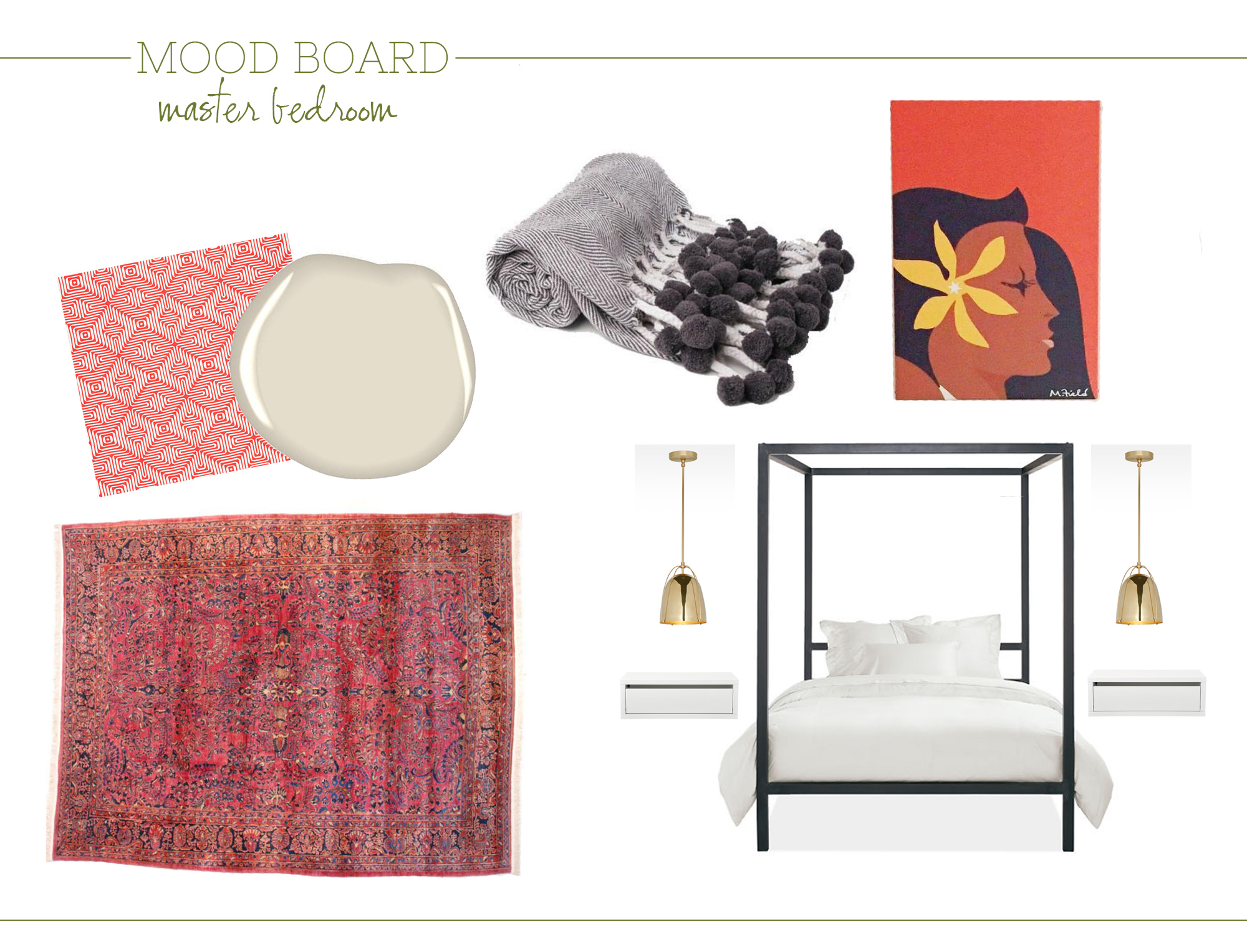
party house master bed inspiration
Ali Hedin | Master Bedroom Inspiration


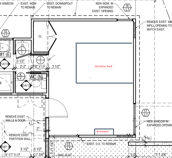
The master bedroom is actually a totally new added on space.  We have a lovely view from our back windows and we can take advantage of it by going up a floor.  Since Mr. Hedin and I aren't interested in a huge house, a full story addition didn't make sense.  Instead, we decided to go up with a small 'master suite' that will take advantage of the view - and give us a little separation from the rest of the house.  

Creating a totally new space is overwhelming.  Luckily we have a fabulous architect, David Coleman, who designed a petite master suite that we are so excited to start building. 

Ali Hedin | Party House Master Bed Inspiration

Since it's a totally new space, there aren't little sketches of what we are changing or adjusting.  It's just new.  

ALI HEDIN | MASTER BEDROOM SKETCH

What we asked for was a bright bedroom that wasn't huge.  I'm not into the grand "master suite" type space with french doors and a separate sitting area.  And since the rest of our house is a modest size, a giant master would have been out of place.

What would you look for in a master bedroom?  Are you a large space person? I'd love your thoughts!

xoxo, ali


SHOP THE INSPIRATION

party house library inspiration
Ali Hedin Party House Library Inspiration

The room that used to be the master bed room is turning into an office/study/computer room that I've decided to call the library.  I like library so much better.  It will have loads of books in the room since I have stacks and stacks of books in the guest room now.  So it does make sense.  

Otherwise, I'm not 100% sure what we're doing with this room.  It will probably have a piano too?   Feeling totally unsure of this space.  I know what I like and what I'm drawn too.  

before.png
IMG_3015.JPG
IMG_3018.JPG
IMG_3019.JPG
IMG_3016.JPG

I do know that this room needs shelves for books + a desk for a computer.  And probably some seating.  There's a chance we'll incorporate some "guest room" elements into this room?  We are accustomed to having a guest room and the new plan doesn't explicitly have one. This space would possibly serve that function.  But it doesn't need a TV - there's one in the living room adjacent.  We don't watch enough television to make two TVs in ten feet of each other make sense.  

Ali Hedin | Party House Library

Here's what we are hoping to achieve with this room

1. Create a computer space 

2. Build shelves for all of the books that are cluttered all over the house.

LIBRARY-CONCEPT-ALI-HEDIN.jpg


Here's how we're doing it

1. Building in shelves and a desk space that will hopefully hold all of the books.

2. Building in seating that could double as a twin bed.

3. Remove the bizarre door and old windows and replace with big windows and a sliding door.


We're actually going to separate off a section of the room to turn into storage.  The master bedroom is a ridiculously huge room because we think it used to be two bedrooms.  At some point, we think they removed the dividing wall and turned it into one giant room with two closets.    Turning the extra space into storage will help with all of the closets that are currently scattered around the house and are going away in the new plan.  

What do you think?  What would you use this room for?


xoxo, ali


shop my library inspiration


party house bar inspiration
Parker Palm Springs via SugarBuzz

Parker Palm Springs via SugarBuzz

Perhaps the most significant spot in the house is the bar.  I know the kitchen is the heart of the home and blah, blah, blah.  But I guarantee that the minute guests come over they are going to pop over to the bar and grab a drink.  Which means, this is the most significant part of the house.

When we first started designing the house with the architect we mentioned that we wanted a bar of some sort.  Originally, we looked at a space near the kitchen.  We just wanted a second sink and a little fridge near some cabinets for booze and glassware (I have a growing collection of vintage barware that needs to be seen!)

Ali Hedin | Weeknight Bar Inspiration

The architect came back to us with a different idea - way far away from the kitchen - and it's brilliant.  The new plan is to have a bar built in near the fireplace.  Perfect for cocktails before dinner - cocktails after dinner  - or cocktails instead of dinner.

I want this little nook to be cool and different from the kitchen and living room.  Both of those spaces will be super basic and this seems like it's screaming for something a little bit "more."  The minute I saw the bench that Sarah Sherman Samuel and Emily Farnham installed in Mandy Moore's house I was obsessed and started stalking down terrazzo designs.  

Sarah Sherman Samuel | Instagram Image
Emily Farnham | Instagram

I adore terrazzo and we know we can't afford total terrazzo floors, but I can probably afford a small terrazzo countertop!  Can you believe how cool this bench is?  Wouldn't it be the best countertop?  Stay tuned because I have to convince Mr. Hedin that it's a great idea...

ALI HEDIN MOOD BOARD | WEEKNIGHT PARTY HOUSE BAR

Because this is a small space, I clearly won't get the entire collection of bar ware loaded into here.  But I want to be able to display some of the goods - probably seasonally?  And I want to not see the booze all the time.  This will be in the middle of the living room and I don't want to look like a total alcoholic.  I've sketched up an idea for an upper level cabinet that will hide the bottles and leave some display space above.  I'm not sure what I think about it.  I still need to have the standard bar ware over here - the glasses we use regularly - and I'm not sure where those live just yet.  

Oh the drama.  Don't I wish all of my life decisions were as hard as "where do I store glasses in the bar."   Let me know what you think!  What would you do?

xoxo, ali


Shop my bar inspiration 


party house living room inspiration
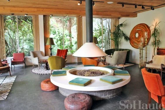
Parker Palm Springs via So Haute

So the dream for the living room is to be an open and inviting room that we can all hang out in - and is open enough for other people to feel invited in.  The current living room is pretty un-inviting.  You have to walk around a goofy little wall to get into the room and it becomes a weird stopping point where we end up hanging in the hallway instead of the actually spacious and inviting room.

Ali Hedin | Party House Living Room

The living room off of the main entrance at the Parker Palm Springs has been a big influence on how we want the space to feel.  The cozy, comfortable room centered around a statement fireplace is what we are going for. 

before.png
Ali Hedin | Party House Before

The living room as it is is the perfect size.  It's big.  I can re-arrange the furniture about a zillion ways unless - of course - you try to arrange around the fireplace.  When we first moved in, I loved the fireplace and the statement it made about the era of the house. 


In talking to the architect, keeping this giant and awkward fireplace intact requires rebuilding the thing.  Why would I want to rebuild something that has been a bit of a headache?  So instead, we're ripping it out.  This will let us have our cool Parker Palm Springs type fireplace instead.

LIVING ROOM INSPIRATION HEDIN.jpg

The other issue with the living room is the lack of ability to get to our backyard.  Those large windows could be doors.  Wouldn't that be great?  Big doors so we can go in and out easily.  In Seattle there are definitely seasons when that would not be the best idea, but the whole summer would be lovely to have the doors open and the dog able to run in and out. 

Here are the priorities:

1. Get rid of the old fireplace and replace with something cooler.

2. Open up the back windows and turn them into doors.

3. Make it more inviting to the front of the house.
 

LIVING-CONCEPT-HEDIN.jpg


Here's the plan. 


1. Remove the fireplace and it opens up to the back room of the house creating a perfect passage into a new den?  Also, a bar can go there now.

2. Sliding doors! Big giant sliding doors!

3. Remove the ridiculous pony wall and replace it with a floating closet/wardrobe deal.
 

Ali Hedin | Party House Inspiration

I'm dreaming of a super cozy space where we can kick back with a cocktail and our friends.  One tiny detail we haven't dealt with yet is where a television goes.  Our architect isn't really the "design around a TV kind of guy" but the reality of needing to watch the Super Bowl or - more importantly - the Oscars is really real. 


What do you think?
 

xoxo, ali


color love | green & blue
Hedin-Green.jpg

Blue and green are such a natural combination together.  Is it because of the sky and the grass?  Algae and water?  Because they live next door to each other on the color wheel and we all learned in art school that they have to go together if they are next to each other on the color wheel?  Who knows.  But it works. 

Alexandra-Hedin-Basil-Cucumber-Cocktail-1.jpg
Ali Hedin | Green & Blue Love

My signature color for about one hundred years has been Verdant Green by Sherwin Williams.  I painted my front door at the old house Verdant Green.  I painted the floors in our current house Verdant Green.  I purchased 12 yards of fabric that's shades of Verdant Green in a stripe pattern.  I painted a stripe in the boy's current bedroom Verdant Green.  It's clear that with the new house, Verdant Green is staying.  I don't think I'd shake it even if I could. 


Ali Hedin | Green & Blue Love

FIND THE THINGS

1. | 2. | 3. 4. | 5. | 6. | 7. | 8. | 9. | 10. | 11. | 12.


Hedin-Society-Social.jpg


xoxo, ali